


The
Gallery
THE
RESULT
The business now has a strong online presence.
Clients can clearly understand services, evaluate credibility, and reach out without friction.
There were 12% increase in enquiries.
Access to a broader, more diverse audience
Improved user experience and engagement.
The website now functions as a lead generation tool.
Instead of just being informational, it actively brings in enquiries and supports business growth.
WHAT I DID
Built the website from scratch
Structured pages for services, about, and contact
Developed full visual identity (Logo, colour palette, and typography system)
Designed a clean, uncluttered interface
Strong hierarchy and consistent spacing
Improved navigation and user flow
Smooth interactions with subtle animations
Modern, non-static layout
Optimised for enquiries
Clear CTAs across the site
Easy access to contact from all sections
Built to support ad traffic and conversions
THE PROJECT
highlights
The goal was to simplify everything...To create a website that feels clear, easy to navigate, and designed aesthetically with the level of service Michael actually offers.
-
Clear headline and CTA right from the first screen; a stronger direction from “browse” to “book a consultation”
-
I redesigned how listings are shown so they feel more interactive and easier to explore, instead of static blocks of information.
-
Quick access to key info like price, type, and links, leading to a more engaging browsing experience
-
Features like Sticky header, Scroll-to-top, Trust signals buttons.
-
Made booking feel quick and straightforward with Calendly
-
Made the site faster by compressing images and cleaning things up behind the scenes
Result: more inquiries and clicks through rate from potential clients.
THE
PROBLEM
There was no digital presence & no existing website.
There was nothing in place to support online visibility or enquiries.
Lack of structure.
Information wasn’t organised, which would make it difficult for users to quickly understand services or navigate the site.
Limited reach.
Without a website, the business was restricted to local, word-of-mouth enquiries.


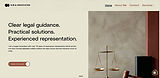
WHAT I MADE
the finished -
Product
Here is the website designed and built from scratch!


Ready for a website that finally does its job?

If your site doesn’t feel like you, or it’s not bringing in the kind of clients you want, let’s fix that. Tell me what you’re building, where you’re stuck, and what you wish your website was doing better, I’ll take it from there.
So, what are you waiting for?